Friday, October 9, 2009

Home of the future - Final inside


This poster displays a clear, simple and futuristic idea of what living in 2010-15 might be like inside a conceptual house. The compound would have minimal furnishings to give the crowded occupants the feeling of space. the view out to the ocean shows the rooftops of other compounds near by.

Home of the future - inside


Home of the future - Sketches: inside


Inside the large circular compound there would be lots of white, lots of space as living in a crowded enviroment, and some greenery.

Home of the future - Final outside


This poster gives a potential solution to the housing crisis that will be faced in the future. the large structures would house many thousands of people with sustainable energy, water etc. there may be turbines underwater to create power from currents, or solar panels on the walls of the building. The forestation on the rooftop provides a sanctuary for wildlife, medicines, food etc. while also allowing people to feel land when the ocean levels have risen to take most of that away due to climate change.

Home of the future - outside


Home of the future - Sketches: outside


Home of the future - synopsis

2010-15

How will we live:

in reality, not very differently than we do today. more environmentally aware, though the main changes are going to come from government policy and large businesses.

To take a less practical and more ideological approach, we will be living in a self sustaining, environmentally friendly and harmonious way. The separations between class/wealth will be gone and the entire planet will live together without conflict. Their will be one government that makes decisions on behalf of the whole planet. Purhaps another crack at communism is in order?

Weather Conditions:

More eratic climate, more destruction of habitat for wildlife and pollutants, which causes effect on water supplies/ozone etc.

There is no positive outlook on climate change in the short or long term future, the pattern has already begun and global warming is in effect. Rising oceans, ice melting etc. only thing we can do to help is minimize destruction of environment etc.

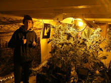
Inside/outside homes:

Inside our homes will be minimal amount of furniture, very clean, basic, well designed, reduction in unnecessary items/clutter, use of whites and clean colours. Use of organic and recycled materials as much as possible.

Outside, will be in the same image. small clean areas, no rubbish etc. but surrounded by greenery, rain forests and wildlife. an integration of home and surrounding landscape/habitation.

Materials:

In reality plastics and other low biodegradable meterials will still be in use. government policy however will make these products more expensive so hopefully a reduction in their production will come into effect.

In the 'perfect world' materials of the future would be recycled or organic/high biodegradable materials for minimal impact on long term environment etc.

Buildings:

Buildings will be either very rounded and curvy to link into the surrounding forests etc. (organic shapes) or will become very square, compound type buildings to reduce amount of space required for human habitation. They will incorporate greenery with simple, white, clean design (lots of windows etc.).

Thursday, October 8, 2009

Home of the future - research articles


Gardens of the future: rain forest, self sustaining, produce medicines, support life

Enviroment of the future: Balance of economical growth and environmental damage, recycle, save energy, buy green products and protect nature/countryside.

Architecture of the future: sustainable, group living. large compounds where people can live equally in comfort and good health.

Wednesday, September 30, 2009

Bauhaus - Final


Final Solution:
I have cleaned up the top section of the black shape to align with the text. There is enough clean, negative space in the layout to allow for the text to be grouped tightly without looking too cluttered and complex. It is interesting and first attracts the eye as an artwork, then conveys the message through the text. This is the basis behind Bauhaus, to create something that combines the arts. My piece uses influences from Bauhaus works, ideologies and has constructivist elements.

Bauhaus - final 3

8:
I have used a soft black shape which gives me the feel, and the extra element i am looking for in the background to break up the large area of text. I have experimented with the red in the word 'knowledge' and the soft pinkish/blue tones are not overbearing in the layout. I wanted that word to stand out while using scale very strongly.

7:
Solution, reduce size of red square. The word knowldge is slightly lost and the strip is very harsh/hard edged.

6:
For this trial i am trying to find something which will break up the background and add another element to the design. The large amount of red is over dominate and takes away from the text.

Bauhaus - trials

5:
Grouped the text, further variations in scale. Have also dulled the background though more vibrant from first poster. It now looks like the paper found in a book and therefore i feel the need for an image of a book is redundant.

4:
Further experimentaion with layout and making clear space to ease the eye when viewing the image. Still not sitting quite right though.

3:
In this trial i have again experimented with colour, enhancing and creating vibrancy. I feel the coffee colour and deep red of the background gives it a cinimatic/antique feel, which i am not attempting to create.

2:
In this design i have experimented with scale, colour, shape and hierarchy. the font is more appropriate to the style though i felt it did not look clean enough. I want to make more negative space in order to give the poster an uncluttered yet interesting feel.

1:
This is my first attempt/idea behind creating a Bauhaus design. I used a paper texture for the background with similar tones to Bauhaus posters i have researched. I also attempted to incorporate a black and white image of a book to relate to the text.

I have also used a clean, clear font though it does not give the right feel for Bauhaus. It is too modern even though it was influenced from Bauhaus typology. I bought 'Bayer Universal' and experimented with this type in my other examples.

Tuesday, September 29, 2009

Bauhaus examples


1919-33

Bauhaus was created with the idea of bringing all arts together as one. There would be no distinction between the fine arts and applied arts. It sought a new way of teaching where 'handcrafted' work was the emphasis, artists and craftsmen teaching together. This is a very practical teaching method.

Teachings that took place at the Bauhaus were wide and varied in the arts. The idea was to teach pupils in many disciplines so as to bring the arts unity. This concept had a profound impact on modernist art and art theories. Much of early Bauhaus teachings were influenced by the constructivist period, hence the typology and design that came out of the school were clear, geometrically focused and very bold.

Bauhaus - Herbert Bayer


Born 1900, Haag, Austria
Graphic designer, painter, photographer and architect.
Started an apprenticeship at age 19 with an architect and designer in Linz, where he produced his first typographic works.

1921, enrolled at the Bauhaus where did a pre-course under Itten, followed by a workshop on Murial painting lead by Kandinsky.
1925, appointed head of a newly created workshop in print and advertising,
1928 left Bauhaus to continue career in deign and artistic directing.

Created 'Bayer Universal' font.

Bauhaus - Josef Albers


Born March 19, 1888, German-born American artist.
Studied in Germany and enrolled at Bauhaus 1920,
Began teaching there 1922 and promoted to professor 1925,
became renowned for stained glass design,
Taught furniture design, drawing and calligraphy,

Like Moholy-Nagy, he helped guide Bauhaus teachings away from expressionism and towards constructivist design, contributing significantly towards industrial design.

Bauhaus - László Moholy-Nagy


Born 20 July, 1895
Hungarian painter and photographer,
Became a professor in the Bauhaus 1923,
Influenced by constructivism,
known for design and industrial integration,
teachings: painting, sculpture, photography, photo montage, metal.

Wednesday, September 23, 2009

Russian Constructivism - Final

The idea behind this poster was to represented Russian constructivist design. The two images show a palace and a tractor, which in combination with text, demonstrates the communist ideology that constructivist would have propagated.

It is clear, incorporates angles, red, white, black, black & white/printed images and has a font appropriate to the style. I have made it brighter than the trials as to stand out and have more impact on the viewer. It is a good example of Constructivism design.

Russian Constructivism - trials


Various steps towards final piece:
Paper texture as seen in some research examples,
Red with worn effect,
images made to look old and printed,
Font type block and strong, the etched trial did not suit style.