

APPRAISAL - Poster Design
Line:
I used a grid system to form natural eye lines. The text “hypergasm” forms a strong horizontal line underneath, which is further reinforced with the text “the forum, Melbourne”. The title of the festival forms vertical lines through the circular shapes above. The Line is creating symmetry and balance.
Shape:
I have used circular shapes to create balance and interest. They counter the balance of the text against the right hand side of the layout. The Text also creates shape in the form of long rectangles that are evident due to the negative space. One such example can be seen if u split the page vertically from the edge of the pink circle.
Colour:
I have used bright colours as they are eye catching and will allow the poster to stand out from its surroundings. To further enhance this effect I have utilized negative space and contrast in the large areas of black. This space gives the Title and colour more impact on the viewer while creating the particular feel I want to portray the festival. It will attract the younger age demographic that my brief requires while also having an alternative feel.
 Final Poster decision:
 The added circular fade in the background creates greater focal point and detail.
 This is pretty much what i'm aiming for. might need to experiment with colour for the main font/festival title.
 This is more what i am looking for... the large negative space works well with the simple desgin elements of shape and colour. The black contrasts well with the bright colourful shapes and font. (could try with Ultra light helvetica neue instead of bold)


 The negative space helps create a single focal point which captures the eye.
  Another great MIA poster... I like the block colouring and knotts of complexity. Lots of little images/patterns put together to create the poster.
 The negative space allows the central image to hold its complexity without making the entire poster crowded.

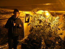
 There is strong contrast between the yellow and black. It divides the layout and creates sharpness within the detail of the figure and trees.
  This is my silhouette version of little red riding hood.
 This is my sweet nut drawing of little red riding hood. The style reminds me of corps bride, this is probably because of the curly tree branches and long/thin arms and legs of the woman.


